The way that mariners acquire weather forecast information has changed dramatically in the past generation. For most of the 20th century, forecasts were provided by government weather services as text products, often delivered by voice radio broadcasts. However, the saying, “a picture is worth a thousand words” certainly applies to weather information, and being able to receive weather maps or weather charts has always been considered to be a significant enhancement of text forecasts.
Weather charts were also transmitted by radio signals in the 1900s — mainly during the second half of the century — but receiving these charts required equipment able to decode the radio signal and transform it into a chart, commonly known as a radiofax receiver. Until about the 1980s, this equipment was expensive and rather bulky, making it impractical for most recreational vessels. Also, receiving the weather charts was time consuming and depended on conditions that allowed the radio signal to be received clearly without interruption. Intermittent or static-filled reception could lead to charts that varied from inconvenient to interpret, to completely illegible.
As radio receivers improved and became smaller, and fax technology advanced later in the 1990s, more vessels were able to take advantage of the radiofax technology, and the use of onboard weatherfax increased. But the most dramatic change has occurred in the early part of the 21st century as Internet access became more practical and more affordable for more vessels, and computers have become smaller and more affordable and therefore commonplace on board. This, in turn, has led to a large increase in the amount of graphical weather information available to the mariner, both on board and ashore, and from both government sources and private entities.
 |
|
Fig. 2: PredictWind sample weather chart for the northeastern Atlantic showing isobars, wind barbs and color-coded wind speed. |
|
Courtesy PredictWind |
Which weather graphics are best?
The question inevitably arises: Which weather graphics are best to use? The answer is, it’s complicated. In addition to the wider availability of weather graphics of different types, navigation software packages have been developed that ingest data from weather models and use vessel performance data in combination with weather data to suggest routes for ocean voyages and calculate expected speed made good along the route. This makes things even more complicated.
First, when looking at a graphical presentation of data, it is critically important for the mariner to know exactly what is being presented, including its source. The first impression of any presentation will be the quality of the graphics. Looking at a screen and seeing an image that is clear and easy to understand fosters an impression that the underlying data is correct. Animations of data made by stepping forward in time in a forecast sequence are also very impressive to the user, particularly if a forecast position of a vessel moving through a proposed voyage is part of the presentation. However, many of the more popular presentations available on the Internet use computer model data that has not been examined or modified by a professional meteorologist.
Why might this be a problem? After all, has not the development and improvement of computer models led to significant improvements in forecast capabilities? The answer to this question is most certainly yes. Computer models are one of the most powerful tools that meteorologists have to produce accurate forecasts. However, they are not perfect. Also, there are several different computer models that are in regular use, and each model has its strong points and weak points that depend on the particular weather pattern in play, geographic areas and other factors.
 |
|
Fig. 3: Two-day forecast from buoyweather.com for a virtual buoy in the Gulf of Maine. |
Raw model outputs
In generating a forecast, today’s meteorologists have access to all of these computer models and use these tools in combination with other means, such as observed data and their knowledge of weather systems, to provide the best forecast possible. Many websites utilize raw model output from just one model to generate their forecast presentations, as do many navigation and weather routing programs. In other words, these forecasts have not been produced by a professional meteorologist and therefore do not benefit from the meteorologist’s expertise, both in terms of knowledge of weather systems and in terms of understanding how the models will perform in different situations. Because of the sophistication of the models, often these presentations will provide a reasonably accurate forecast for a given route most of the time — but not all the time.
So let’s take a look at some of what is available online.
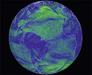
The “Earth” website (earth.nullschool.net) offers a unique and pleasing view of wind circulation around the globe (Figure 1). They describe it as “a visualization of global weather conditions forecast by supercomputers updated every three hours.” The user can adjust the point of view, the map projection and the zoom level. This presentation allows a very good visualization of how weather systems interact with one another by showing the wind circulation with no other information to clutter the screen. Other parameters can also be displayed. But in the end, this site shows only model data, not refined data that has been examined and/or adjusted by a professional.
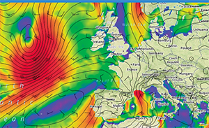
Another website that offers some rather crisp graphics is predictwind.com. This website focuses on offering maps that can be customized to any part of the world’s oceans and can display several different parameters. One type of chart that is quite popular is an image of wind speed, shown with traditional wind barbs as well as color-coding, superimposed over the area of interest (Figure 2). Charts of sea state, isobars, temperature, wind gusts and other parameters are also available. A basic service is offered at no cost (registration is required), and a more robust set of products is available at a few different subscription levels. Predict-Wind also offers what they term as “Departure Planning” and “Weather Routing” services. These services are very similar to some onboard software programs, although the software programs incorporate more sophisticated vessel performance data.
 |
|
Fig. 4: National Digital Forecast Database (NDFD) coverage area. |
The PredictWind weather data is all model driven. They offer two different well-known models and also produce data from two of their own proprietary models for which they claim greater accuracy. But none of the data is regularly reviewed by a professional meteorologist in real time. As they correctly state on their website, if all of the models show a similar forecast, that will increase the user’s confidence level in the data. When there are differences, though, the user is left to try to determine which model is more accurate, and in some situations the differences between models can be quite significant and could lead to very different decisions for an ocean voyager.
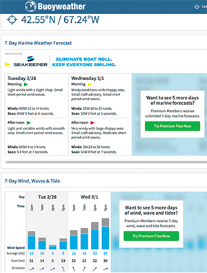
Yet another popular website that offers several different ways to view weather data is buoyweather.com. Their basic premise is that the user can create a “virtual buoy” in any location and access forecast data for that location (thus their site name). This has tremendous appeal over the oceans because of the relative lack of actual data. Forecast information for virtual buoys is available at no charge for two-day forecasts (Figure 3), but like PredictWind, higher levels of service require a subscription. Thus, to obtain forecasts out to seven days, you must pay a fee. The subscription service also provides access to other products, including weather charts customizable for any area. Again, this information is derived solely from model output, and those using the service need to be aware of this. The Buoyweather organization does employ a staff of meteorologists, however, and they offer custom forecast services provided by professionals for additional fees.
The Buoyweather and Predict-Wind situations illustrate very nicely why certain services can be offered at low or no cost to users, while others require a higher cost. Once software is in place to ingest model data and then display it in a specified way, the system can run 24 hours per day with little intervention, and the personnel costs to the organization are minimal. Websites like Buoyweather and PredictWind are counting on users trying their free offerings and being impressed enough to move up to a higher level of service, and given the quality of their graphics and user interfaces, this likely works well for them. However, when more comprehensive services are provided that involve professional meteorological consultation to help interpret the model data, the personnel costs are naturally higher. Weather is a 24/7 proposition for oceangoing mariners, and providing professional support to take account of this is more costly. Those who require that type of service should expect to pay more for it. Bottom line: You get what you pay for.
 |
|
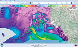
Fig. 5: NDFD wind speed depiction, forecast valid 0000 GMT 1 March 2017. |
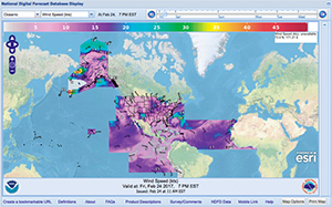
A more recent arrival on the weather graphic scene is the National Digital Forecast Database. This product is produced by NOAA forecasters at the Ocean Prediction Center and the National Hurricane Center, and is available on both websites. This product allows users to display color maps of several different parameters (one at a time) on an adjustable map base with forecast times up to five days ahead. The coverage area includes offshore waters of the U.S., including Alaska and Hawaii as well as tropical waters through the entire Atlantic and the eastern Pacific (Figure 4). By hovering over any point on the maps, the values of the selected parameters can be read (Figure 5). The big difference between these presentations and many others is that the database is populated by forecaster-generated data rather than model data. At this time, the product is considered experimental, but it has been available for a few years and it will likely become fully operational soon. It works best with a high-speed broadband connection, so it will be most useful when ashore and may be tough to use aboard when offshore and the Internet connection is slow.
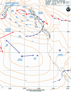
Speaking of being offshore, even with a slow Internet connection, only email service and no web access, it is possible to download weather charts from the Ocean Prediction Center and the National Hurricane Center through the FTPmail protocol. These charts are not as fancy as many of the color graphic displays noted above, and some might even call them “old-fashioned,” but they are produced by meteorologists, and, by using the full suite of analysis and forecast charts, they do show weather systems and their motion as well as marine weather warnings. In fact, even if other weather graphics packages are utilized, downloading these charts should be a regular part of the onboard routine for obtaining weather forecast information. These meteorologist-produced charts will greatly increase the value of other model-based graphics (see Figure 6, compared with Figure 5).
Weather routing programs
There are several weather routing programs that can be installed on onboard computers to provide suggested routes based on vessel capabilities and expected weather conditions. These programs are generally utilizing weather data from one model. Again, examining data that has had input from a professional meteorologist and comparing with the model data and the suggested route from the program is strongly suggested in order to pick up on situations when the particular model in use may not be performing well. Some programs also allow downloads of OPC and NHC charts. Whenever there is a conflict between model data and forecasts produced by a meteorologist, it is best to put more confidence in the information from the meteorologist. Remember, the meteorologist has access to the same model data that are used in these programs, but also has access to other model data and will draw on their professional experience and expertise to come up with a forecast. If the forecast by a meteorologist is different than model data shown in a presentation, there is usually a good reason.
 |
|
Fig. 6: Ocean Prediction Center 24-hour forecast chart at 0000 GMT 1 March 2017, same time as NDFD chart in Fig. 5. |
To summarize, when using weather graphics from any source, it is important to understand the source of the weather forecast data that is being used. Model output is a very powerful tool but should not be the only source of data that is used to make decisions. Displays such as the Earth website, Buoyweather, PredictWind and others offer wonderful ways to view model data and thus can be very useful, but these should all be supplemented by data that has been produced by a meteorologist. This could include using a consulting service (such as the higher-end services offered by Buoyweather, or other meteorological consulting services), or by accessing the National Digital Forecast Database.
Also, to gain a full understanding of the weather pattern, it is best to use something more than charts that show just one parameter, such as wind direction or significant wave height. The Ocean Prediction Center and National Hurricane Center surface charts that show isobars, high and low centers, fronts and other features — used in combination with some of the pleasing graphic products that are available — will provide a more complete understanding of the weather conditions that are affecting and will affect an ocean passage, and ultimately will lead to better weather-related decisions.
Contributing editor Ken McKinley is the founder and owner of Locus Weather in Camden, Maine.
 |