The recent article describing various vessel groundings and losses in the Pacific during the last year or two (“More than zoom levels,” January/February 2018) highlights a glaring weakness in many electronic charts. This should, by now, be widely understood but is still unrecognized by far too many mariners.
Let’s go back to November 2014. Vestas Wind, one of the boats participating in the round-the-world Volvo Ocean Race, is romping along at 16 knots in the Indian Ocean. There is a loud crack — the daggerboard has sheared off. The boat pivots hard to port; the keel strikes the bottom and Vestas Wind is aground in 6-foot breaking seas on the Cargados Carajos Shoals, 240 miles northeast of Mauritius.
Waves are washing over the boat. Vestas Wind is pitching and rolling violently, throwing the crew about. The boat is breaking up, losing both rudders, the keel and large sections of the hull as she is driven higher onto the reef. Water is flooding various compartments and the ship’s lithium-ion batteries are beginning to smoke, threatening to go up in flames. In the early hours of the following morning, the crew is able to scramble off the back of the boat onto the sheltered side of the reef from where they are rescued later that day. Remarkably, all are safe and unharmed.
Just as with several of the losses in the Pacific described in Ocean Navigator’s recent article, no one aboard was aware the reef existed, in spite of the fact that the area had been resurveyed from 2008 to 2010 by the Indian Hydrographic Office. The electronic charts in use were accurate and current, and a highly experienced navigator was in charge of route planning. So how could this happen?
To understand this, we have to look at how charts are made.
 |
|
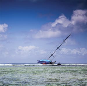
Nigel Calder’s boat Nada aground on the River Ilen in Ireland. |
|
Nigel Calder |
The chart making process
Hydrographers take soundings, typically collected by running straight lines and accurately positioning these and any submerged landmasses. In shallow and inshore waters, these lines are closely spaced to ensure that no intervening features are missed. The deeper the water and the farther offshore, the more widely spaced these survey lines are because missing the numerous features between them is less relevant.
Hydrographers typically conduct surveys at a larger, more detailed scale than those used to produce the charts derived from the survey. As many soundings as possible are collected and crammed onto the survey sheet, to the point that traditional pre-digital survey sheets can be almost illegible. It is the job of the chart maker — the cartographer — to reduce this mass of data to a legible level without losing essential details. Considerable skill is required for chart making, governed by conventions that have evolved over centuries, starting with the British Admiralty’s establishment of the first national hydrographic office in the late 1700s.
For obvious reasons, the first priority of cartographers has always been to display areas of shallow water together with hazards, such as rocks and reefs. Large-scale charts that cover a small area in great detail have room to add plenty of soundings, such as narrow channels between shoal areas. Small-scale charts (covering a large area in little detail), on the other hand, do not have the space to legibly add fine detail once the low-water areas have been inked. As a result, the more you zoom out with paper charts, the larger the shallow-water areas get. There is absolutely no misunderstanding concerning hazards.
Where did the reef go?
There are two types of electronic charts: raster and vector. A raster chart is an electronic photograph of a paper chart, so the same shallow-water features are reproduced; shallow water is always clearly identified, regardless of scale. A vector chart is an entirely different animal. All of the data on the most detailed (largest scale) chart or survey sheet is captured in a database and is available to be displayed at any chart scale. When you zoom in, at some point you get all this information. When you zoom out, if this information were to be retained, the chart would rapidly become so cluttered that it would be unreadable. This is where the traditional cartographer removes detail to make the chart legible, preserving the shallow-water soundings.
Reducing the clutter on vector charts is done in the software. As outrageous as it sounds, it is not uncommon for vector software to remove the shallow-water soundings! This is exactly what happened with Vestas Wind, and, reading the accounts in the recent issue, I suspect the same has underlain several of the recent losses in the Pacific. Given the zoom level at which the Vestas Wind navigator did his route planning, and at which the digital charts were being used while at sea, the reef simply disappeared from view. The shallowest water displayed was 130 feet. The navigator plotted a course directly across the reef.
 |
|
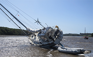
Calder finds the angle a bit challenging. |
|
Nigel Calder |
There is another problem with all electronic charts, both raster and vector. These are invariably displayed on screens that are a fraction of the size of a paper chart. As a result, unless we zoom out we get very little “peripheral vision” — i.e., little context in terms of the surrounding water and landmasses. Route planning and sailing longer passages more or less requires zooming out to a considerable extent, at which point all local details are lost, often including shallow water and other hazards.
Had the Vestas Wind navigator zoomed in to the most detailed electronic chart on board, or consulted a paper chart at any scale, the reef would have been clearly visible.
Best navigational practices
Although I carry paper charts as a backup, I primarily rely on vector-based electronic charts for our navigation these days. In order to avoid the pitfalls that come with this reliance, whenever I am route planning I zoom out the chart to the extent that is necessary to provide the peripheral vision needed for planning but then zoom in to the highest (most detailed) zoom level available and work my way along the track I have laid down, looking for potential obstructions and other hazards in the vicinity of the route. This way, I get to see the reefs and other hazards that led to the loss of Vestas Wind and the recent losses in the Pacific.
We still hit the bottom from time to time, but that is because I like to push my luck when gunkholing and not because I am using electronic charts at an inappropriate scale! My book How to Read a Nautical Chart describes these and other potential issues with electronic charts in some detail.
Systems expert and bestselling marine author Nigel Calder sails aboard his latest sloop called Nada, a Malo 46. His books include: Boatowner’s Mechanical and Electrical Manual, Marine Diesel Engines, Cuba: A Cruising Guide and more.